Clients
From Illustrator to the Tea Table — New Steepers Only Honey Labels
Aug

Two flavors. One bold vision.
We took Steepers Only ’s new Lemon Honey and Cranberry Honey from concept sketches to fully printed 4”x5” labels — complete with custom illustrations, brand-consistent typography, and FDA-compliant panels.
Lemon Honey & Cranberry Honey — From Concept to Event-Ready
When Steepers Only introduced their two new flavored tea honeys — Lemon and Cranberry — they needed labels that were visually striking, brand-consistent, and ready for high-quality printing. This project covered everything from creative direction to final printed bottles, plus product photography for promotional use.
Below is the step-by-step breakdown of how these labels came to life.
Step 1: Understanding the Brand Vision
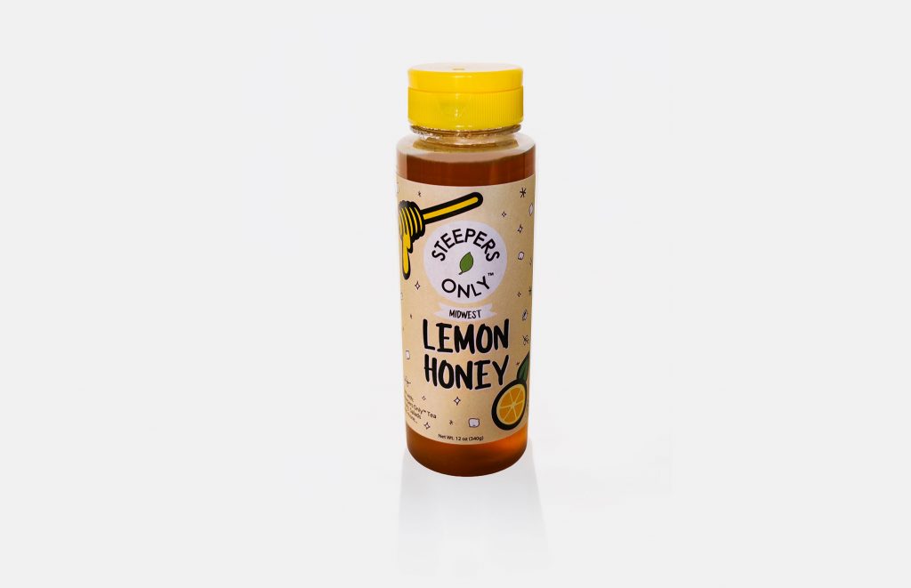
The client’s inspiration came from the bold, minimal style of GRAZA squeeze bottles. The goal was to create a monochromatic label base in yellow (to match honey and the pre-selected yellow bottle caps), with layered illustrations and typography that convey flavor instantly.
For Lemon Honey, the concept included:
-
Steepers Only logo top-center
-
Large “LEMON HONEY” text with the word “Flavored” subtly placed in between for compliance
-
Illustration of a hand squeezing a lemon into a teacup
-
Side panel with ingredients and branding details
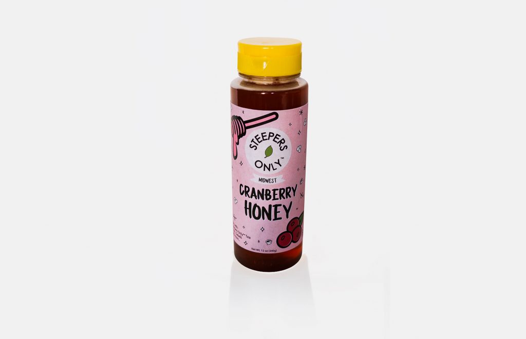
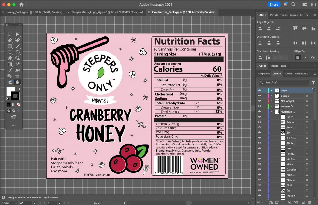
For Cranberry Honey, the concept included:
-
Steepers Only logo top-center
-
Large “CRANBERRY HONEY” with “MIDWEST” above in smaller text
-
Honey wand tip dripping cranberry-red honey
-
Cranberry illustrations integrated into the background
-
Side panel with ingredients and branding details
Both bottles required a full nutrition facts panel and barcode.
Step 2: Setting Up the Label in Adobe Illustrator
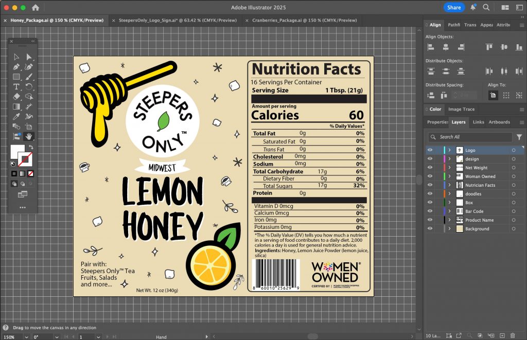
With no manufacturer template provided, I created a 4” x 5” artboard in Illustrator. This ensured compatibility with any 4” x 5” label paper.
Each label file was organized into layer groups for:
-
Base Color Layer — Solid yellow fill for Lemon; yellow + cranberry accents for Cranberry.
-
Illustration Layer — Hand-drawn vector lemon squeeze scene and cranberry wand/drips.
-
Typography Layer — Steepers Only logo, flavor name, and required compliance text.
-
Side Panel Layer — Ingredients, net weight, and formatting matching existing Steepers Only tea bag packaging.
-
Compliance Layer — Nutrition facts and barcode, placed to meet FDA label standards.
Step 3: Creating the Illustrations
The illustrations were designed in vector format for sharp printing:
-
Lemon Honey — A fresh lemon wedge being squeezed into a steaming teacup, with droplets illustrated for motion.
-
Cranberry Honey — A honey dipper dripping deep red cranberry-infused honey, surrounded by cranberry fruit icons in the background.
To tie them together, both shared a modern minimalism style inspired by GRAZA but with Steepers Only’s brand personality.
Step 4: Typography & Compliance
The typography hierarchy was carefully considered:
-
Flavor name — Largest, boldest type on the label.
-
“Flavored” or “Midwest” text — Smaller, lighter-weight font for subtle emphasis.
-
Ingredients & Net Weight — Small, legible, FDA-compliant font size at the bottom.
The side panels mirrored Steepers Only’s tea bag label design for brand consistency. The nutrition facts panel and barcode were placed on the opposite side of the illustration for balance.
Step 5: Proofing & Finalizing for Print
Once both designs were approved, I:
-
Checked CMYK color profiles for accurate print colors.
-
Converted all fonts to outlines to avoid printing errors.
-
Exported as high-resolution print-ready PDFs.
Step 6: Printing & Application
Labels were printed on premium adhesive label stock. Each was trimmed to 4” x 5” and applied to the honey squeeze bottles by hand. The yellow caps tied the visual theme together.
Step 7: Product Photography
With the labeled bottles complete, I photographed them in:
-
Studio settings for e-commerce and marketing use.
-
Styled product shots paired with tea cups, honey dippers, and fresh fruit to suggest flavor.
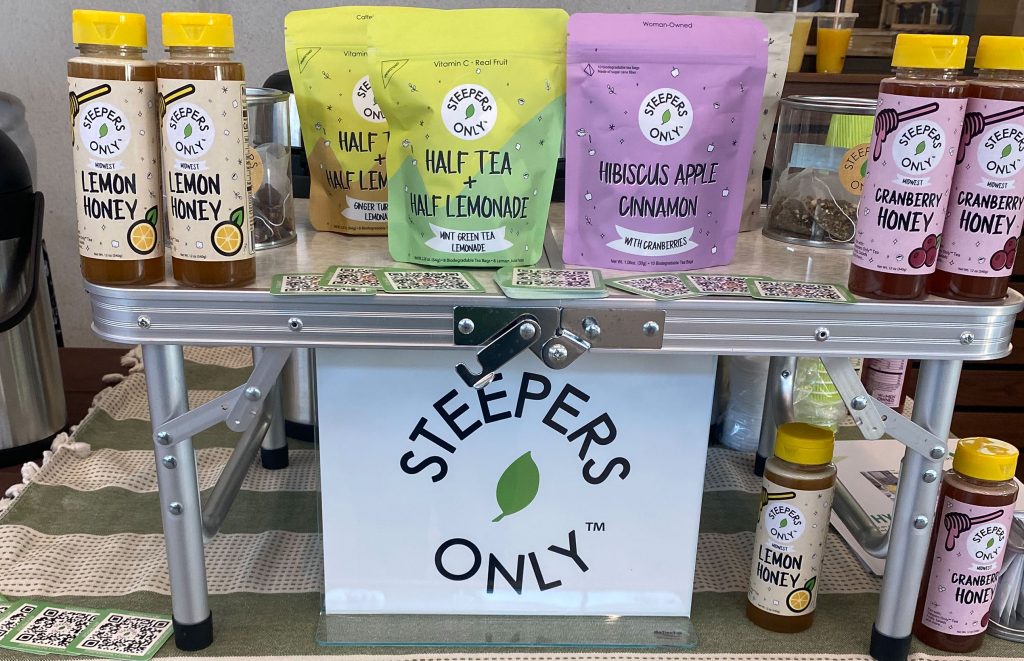
Step 8: In Action at a Live Event
The final step was seeing the products in their natural environment. At a Steepers Only live event, the honey bottles were used alongside fresh brewed tea for guests. This gave us lifestyle shots that captured the real-world appeal of the product.
Ready to bring your product vision to life?
Whether you need bold, shelf-ready packaging or a complete branding overhaul, I can take your idea from concept to customer-ready — just like we did for Steepers Only.
Let’s create something that sells before they even taste it.
Call 312-380-5745 or Contact me online to get started today.