Free Ebook
The Chicago Web Designer Guide (82 Page PDF)
"*" indicates required fields
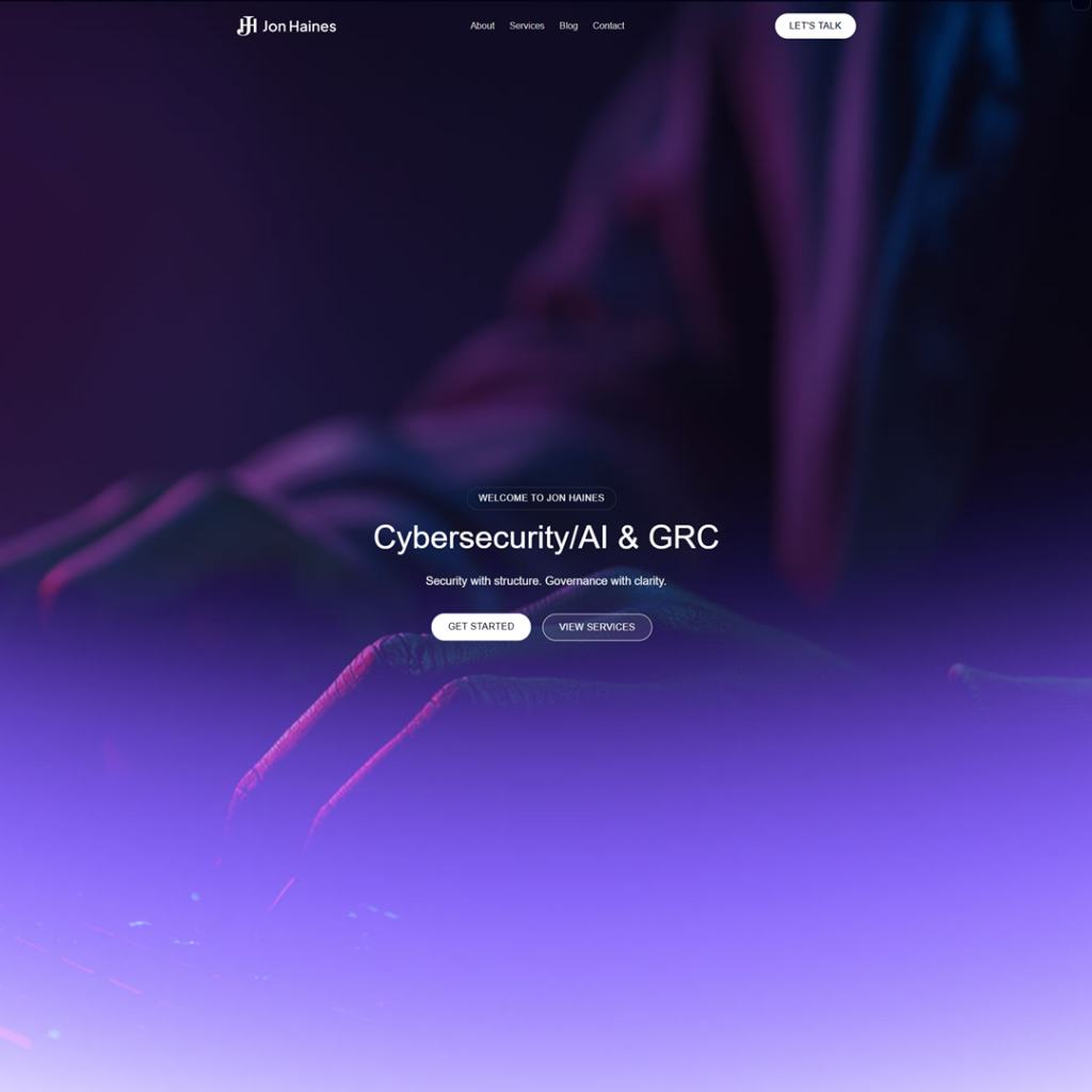
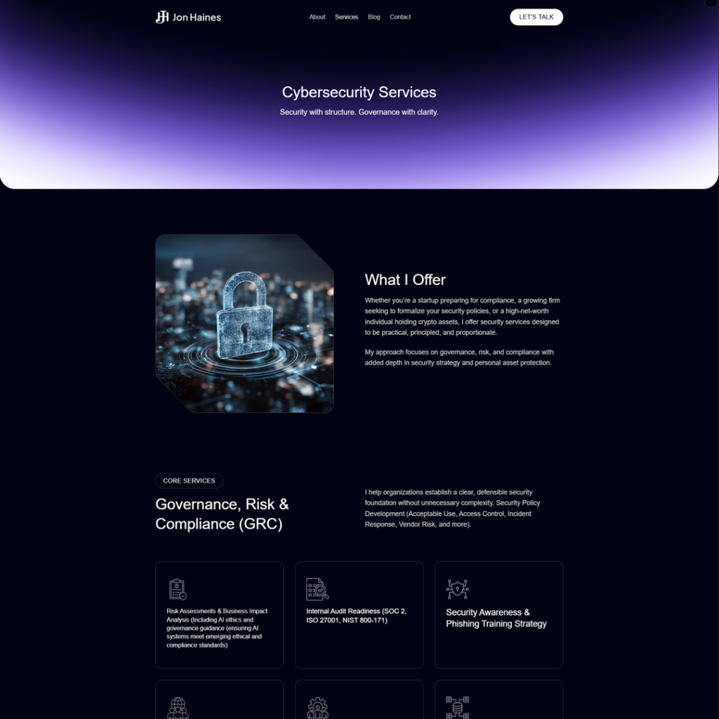
Jon Haines, a certified cybersecurity professional and avid philosophy writer, approached us for a comprehensive redesign of his personal website, jonhaines.com. His site serves dual purposes – showcasing his cybersecurity consulting services and hosting his philosophy blog. Our mission was to rebuild the site on WordPress using Multisite. We set out to elevate the site’s aesthetics and performance while preserving all of Jon’s content and the distinct focus of each section (cybersecurity and philosophy). The end goal: a fast, visually engaging, mobile-friendly site with cohesive branding across both sections and a streamlined user experience.
Despite the valuable content Jon had developed, the old website was holding back his online presence. We identified several key challenges that needed to be addressed in the redesign:
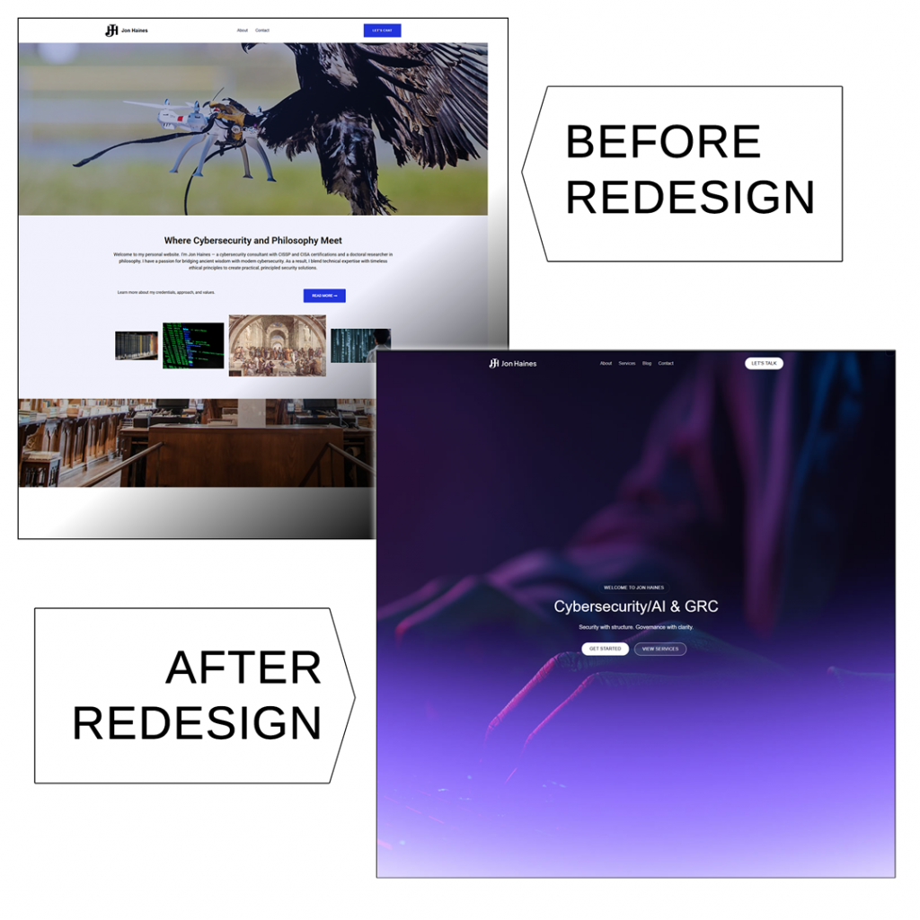
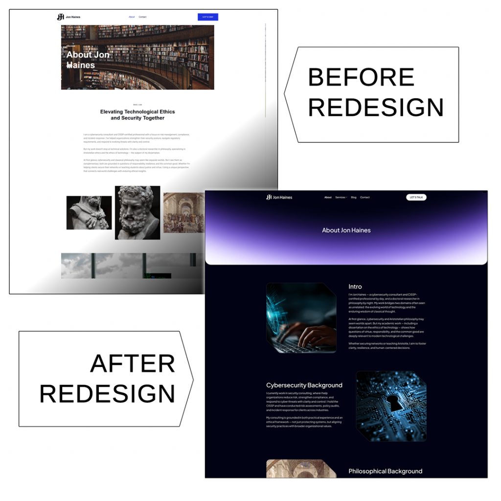
Outdated “Template” Look: The previous design looked generic and “cheap,” undermining Jon’s credibility. It lacked custom touches and professional typography, giving the impression of a stock template.
Inconsistent Branding: Jon’s site is essentially split into two sections – cybersecurity and philosophy – but the branding and design between them weren’t consistent. We needed a unified design language that still allowed each specialty to have its own identity.
Slow Performance: The Elementor-based setup, along with accumulated plugins and bloated code, made the site sluggish. Pages took too long to load, potentially driving away visitors. Jon was also on a standard Bluehost plan, which compounded performance issues. We knew that migrating away from the heavy page builder and optimizing the site would be critical for speed.
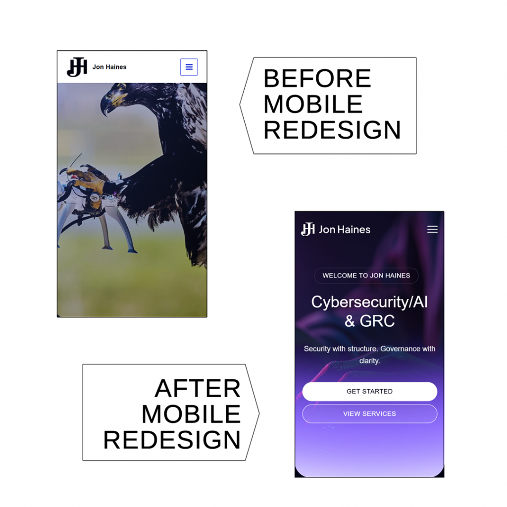
Poor Mobile Responsiveness: The site wasn’t fully optimized for mobile devices. Some layouts didn’t translate well to smaller screens, meaning mobile users had a subpar experience. In an era where many first impressions happen on phones, the redesign had to be mobile-first.
Suboptimal User Engagement: The old site had usability issues that could frustrate visitors. Jon wanted a more effective call to action – specifically, integration of his HubSpot meeting scheduler for easy bookings.
Maintenance Difficulties: Behind the scenes, managing content was harder than it needed to be. The Elementor editor, while powerful, was overkill for Jon’s needs and introduced complexity. The WordPress backend had clutter from prior iterations (e.g. unnecessary plugins, old page builder artifacts), which made self-edits and updates daunting for Jon. He needed a cleaner, more user-friendly backend so he could make updates himself without fear of “breaking” the site. We also saw an opportunity to lay better groundwork for SEO (search engine optimization) and analytics, which weren’t fully utilized on the old site, to help Jon’s site be more visible to potential clients in search results.
We tackled these challenges with a ground-up redesign, acting as both web designer and developer to revamp Jon’s online presence. Our approach centered on using WordPress with Multisite as a foundation for a fast and flexible site. Here’s how we solved each issue and improved the site’s design and functionality:
Fresh, Custom Design: The new design shed the “cookie-cutter” feel by incorporating custom graphics and a modern layout tailored to Jon’s content. The result is a polished look that immediately conveys professionalism and credibility, in line with Jon’s expertise.
Cohesive Branding Across Sections: Using a single theme for both the cybersecurity and philosophy sections allowed us to enforce a consistent branding and navigation structure. This design consistency reinforces Jon’s personal brand across all his content.
Performance Optimizations: Speed was a top priority. By dropping Elementor, we vastly reduced page load times (no more heavy page-builder scripts loading on every page). The difference is immediately noticeable – pages that dragged before now load quickly, improving the experience for every user.
Mobile-Responsive Layout: We adopted a mobile-first approach in the redesign. This ensures Jon’s message is accessible to clients on the go.
Enhanced Usability & Navigation: We made numerous UX improvements across the site. All these tweaks collectively make browsing the site simpler and more engaging.
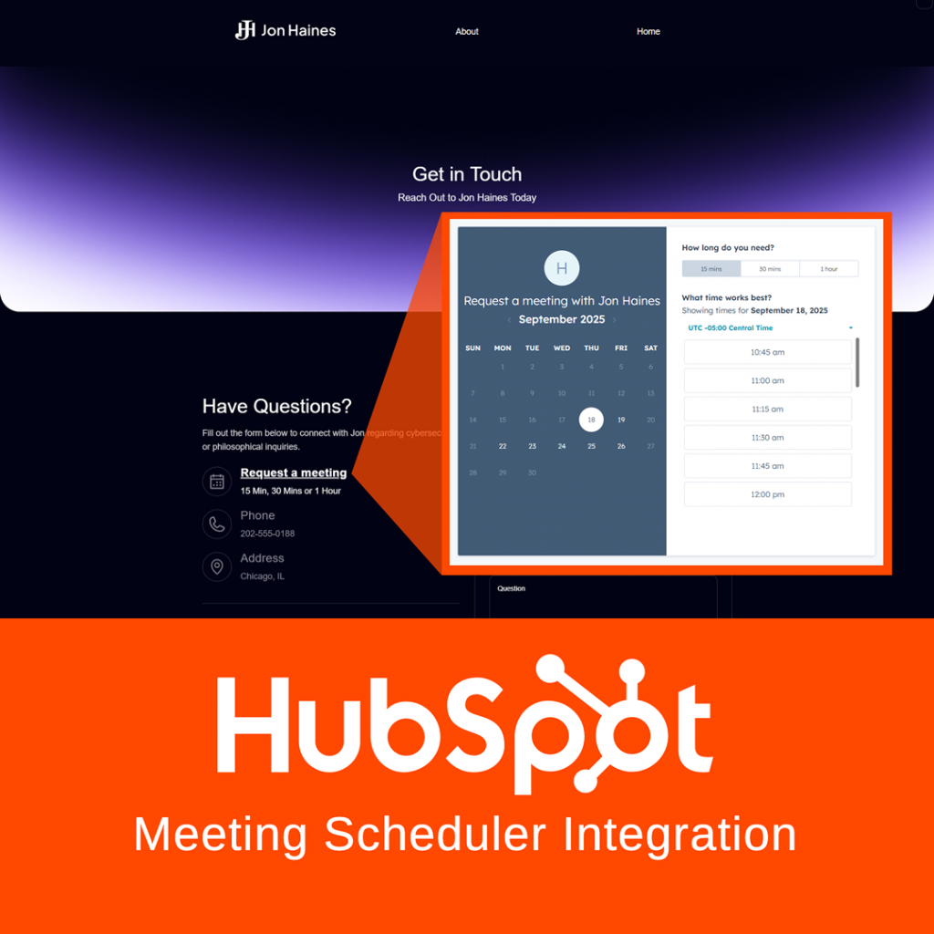
Stronger Calls to Action: We integrated Jon’s HubSpot “Book a Meeting” scheduler across the site, including a prominent call-to-action button in the navigation and on relevant pages. By standardizing these contact paths and highlighting the “Book a Meeting” option, the site actively invites engagement.
Simplified Backend & Training: We focused on making the backend as user-friendly as possible. We also included a one-hour live training session as part of the project, where we guided Jon through using his new site’s editor.
SEO Foundations and Future Growth: We installed Google Analytics and configured basic SEO settings. We also did some initial keyword research and a competitor research, incorporating those insights into the content structure. In short, the redesign isn’t just a one-time facelift; it’s a durable platform that can grow with Jon’s goals, whether he remains a solo consultant or builds a larger brand around his work.
We set up WordPress Multisite so that instead of running everything under a single WordPress installation, we could split the project into two distinct sites that live within the same network:
Cybersecurity site – focused on the consulting and business services side. This has its own theme settings, plugins, menus, and content, tailored to the professional/technical audience.
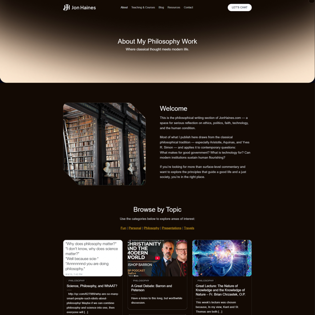
Philosophy site – a separate site under the same network, but with its own look, layout, and content strategy. This allows it to feel more personal and exploratory, without interfering with the business side.
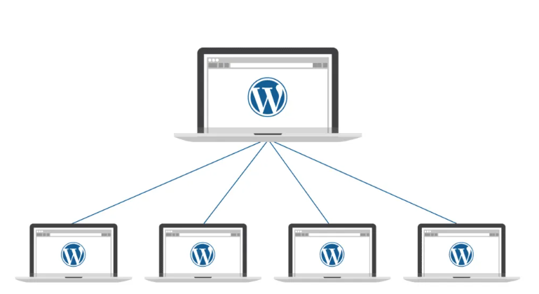
With Multisite, both sites:
Share one WordPress installation (so updates, hosting, and management are centralized).
Still act independently (each can have its own domain or subdomain, themes, and content).
Keep content, users, and branding separate, which prevents the two very different audiences (business vs. philosophy readers) from overlapping or getting confused.
This setup gives you the flexibility of two websites with the efficiency of one system to manage.
The project achieved all its core objectives, significantly improving the site’s visual appeal, speed, responsiveness, and usability. Here are some of the most impactful results of the redesign:
Polished Visuals & Cohesive Branding: The website now presents a modern, professional face to visitors. This cohesive branding boosts Jon’s credibility in the eyes of his audience.
Improved Speed & Performance: By eliminating bulky page builder code and optimizing assets, we dramatically sped up the site’s performance. This performance boost was achieved despite the previous hosting limitations (we worked within Jon’s existing Bluehost environment), proving that smart development choices can overcome infrastructure constraints.
Mobile-First User Experience: The new design is fully responsive, providing a first-class experience on smartphones and tablets. A better mobile experience means visitors are more likely to stay and engage with the content.
Enhanced Usability & Engagement: Usability improvements have made the site much more engaging and easy to use. Overall, the site now has a logical flow: visitors can smoothly learn about Jon, delve into his writings, and understand his services without hitting dead-ends or perplexing UI issues.
Streamlined Contact & Conversions: Perhaps one of the most important outcomes is how the site now encourages interaction. The “Book a Meeting” call-to-action is prominently featured and impossible to miss, making it far more likely that a curious visitor will convert into a scheduled call.
Jon’s reaction to the new website has been overwhelmingly positive. Throughout our collaboration, he provided feedback that affirmed we were hitting the mark. Here are a few of his comments:
“The updates look really great. We’re about 90% of the way there now… thanks for all the work you’ve put into this.”
“Really pleased with how this is shaping up. I’m excited to see it all come together.”
“I think everything looks great… Other than that, I think we’re ready to go live!”
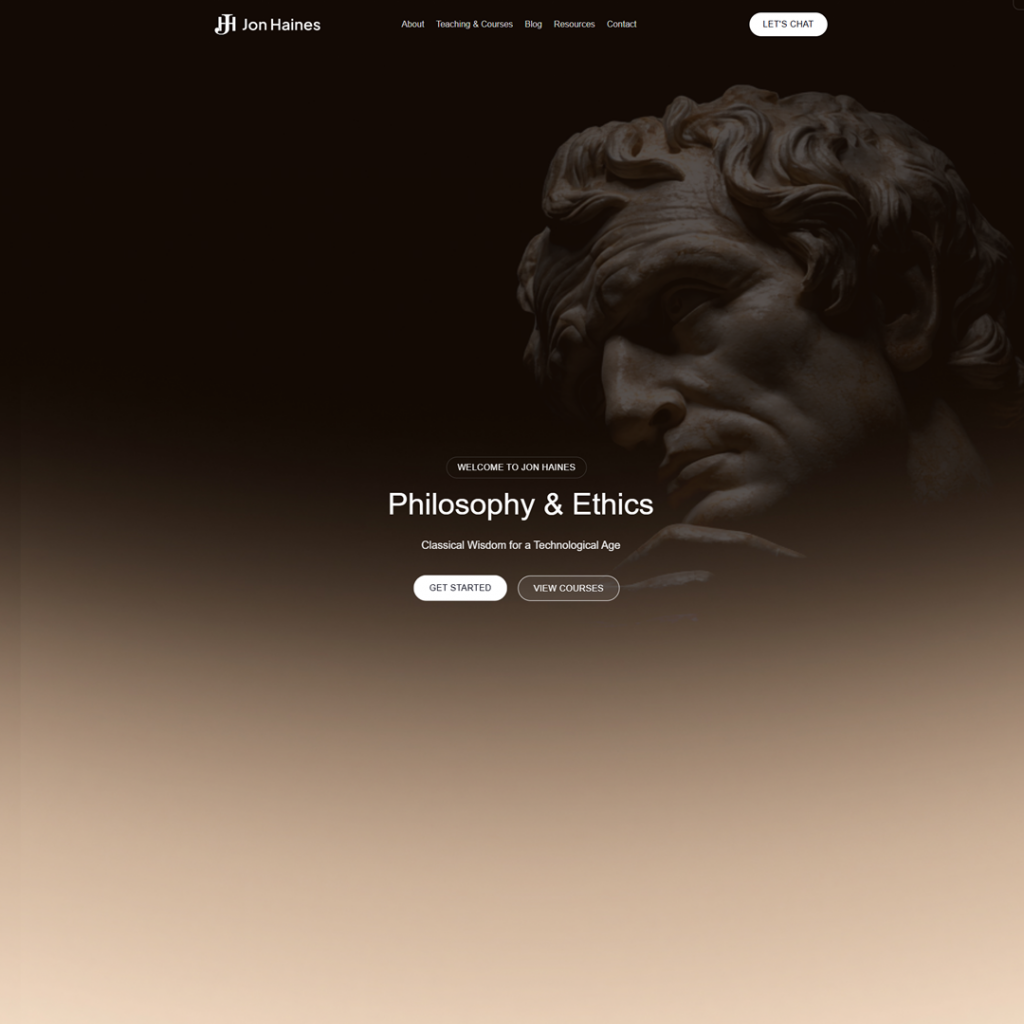
In short, Jon was thrilled with the transformation. He especially liked the improved aesthetics – noting the faded statue graphic on the Philosophy page as a favorite touch – and appreciated the site’s new ease of use. As he succinctly put it in our final review, everything was “looking great!”. It was gratifying for us to see our work not only meet but exceed the client’s expectations.
The jonhaines.com redesign project was a success on all fronts: the site now reflects the professionalism and unique dual expertise of Jon Haines, with a design that is visually engaging, fast, mobile-friendly, and easy to maintain. The project also laid a foundation for future growth – whether that means adding new content, integrating more features, or scaling up the site as Jon’s audience expands.
Does your website need a similar transformation? We specialize in turning outdated or underperforming sites into modern, effective platforms that elevate your brand. Whether you’re a consultant, a small business, or anyone with a web presence that isn’t living up to its potential, we’re here to help. Reach out to us for a conversation about your goals – let’s discuss how we can take your site from “okay” to outstanding. Your future clients are looking for you online: let’s make sure they love what they find.
Contact me today for a free estimate and discover how I can help you increase leads, traffic, and conversions.